Bootstrap Custom 3D Panel Heading
In this post we will show you Bootstrap Custom 3D Panel Heading, hear for Bootstrap Custom 3D Panel Heading we will give you demo and example for implement.
Bootstrap panel is one of the widely used components of the Bootstrap framework. Most of the time a web developer used them when they require to place their contents in the box for better presentation. Although Bootstrap extremely simplifies your websites front end designing tasks it is not elegant and we need to customise it for a better appearance.
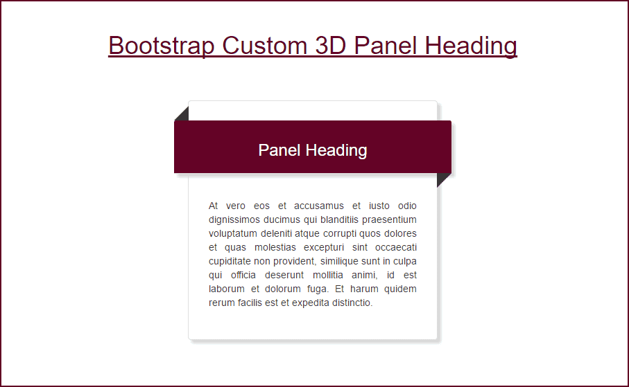
In this tutorial, I will show you how to customise Bootstrap panel heading in order to give a better look and feel. I used the before and after selector of CSS and some animation to make a wrapper around the panel heading. The final output image is given below.
Let's start coding,
The CSS code is given below.
<style>
  .outer{
      padding: 2em 1em;
      box-shadow: 5px 5px 5px #d9d9d9;
  }

  .headerbar{
      background: #640326 !important;
      color: #ffffff !important;
      position: relative;
      margin-bottom: 1.5em;
      margin-right: -2.5em;
      margin-left: -2.5em;
      box-shadow: 5px 5px 5px #d9d9d9;
  }
  .headerbar:before{
      content: "";
      position: absolute;
      border-bottom: 1.5em solid #333;
      border-left: 1.5em solid transparent;
      left: 0;
      top: -1.5em;

  }
  .headerbar:after{
      content: "";
      position: absolute;
      border-top: 1.5em solid #333;
      border-right: 1.5em solid transparent;
      right: 0;
      bottom: -1.5em;
  }

  .headerbar:hover {
    transform:scale(1,1.1);
  }
  </style>
I will explain the code later in this tutorial.
Now the Bootstrap container codes.
<div class="container">
  <h1 class="text-center" style="padding: 50px 0px; color: #640326; "><u>Bootstrap Custom 3D Panel Heading</u></h1>
  <div class="row">
    <div class="col-md-4 col-md-offset-4" >
      <div class="panel panel-default outer">
        <div class="panel-heading headerbar">
          <h3 class="text-center">Panel Heading</h3>
        </div>
        <div class="panel-body text-justify">
            At vero eos et accusamus et iusto odio dignissimos ducimus qui blanditiis praesentium voluptatum deleniti atque corrupti quos dolores et quas molestias excepturi sint occaecati cupiditate non provident, similique sunt in culpa qui officia deserunt mollitia animi, id est laborum et dolorum fuga. Et harum quidem rerum facilis est et expedita distinctio.
       </div>
      </div>
    </div>
  </div>
</div>
The above code does not require any explanation. It is just a basic bootstrap grid system with the bootstrap panel. The complete code of this page is given below.
<!DOCTYPE html>
<html lang="en">
<head>
  <title>Bootstrap Custom 3D Panel Heading Demo - ShareurCodes</title>
  <meta charset="utf-8">
  <meta name="viewport" content="width=device-width, initial-scale=1">
  <link rel="stylesheet" href="https://maxcdn.bootstrapcdn.com/bootstrap/3.3.7/css/bootstrap.min.css">
  <script src="https://ajax.googleapis.com/ajax/libs/jquery/3.2.0/jquery.min.js"></script>
  <script src="https://maxcdn.bootstrapcdn.com/bootstrap/3.3.7/js/bootstrap.min.js"></script>

  <style>
  .outer{
      padding: 2em 1em;
      box-shadow: 5px 5px 5px #d9d9d9;
  }

  .headerbar{
      background: #640326 !important;
      color: #ffffff !important;
      position: relative;
      margin-bottom: 1.5em;
      margin-right: -2.5em;
      margin-left: -2.5em;
      box-shadow: 5px 5px 5px #d9d9d9;
  }
  .headerbar:before{
      content: "";
      position: absolute;
      border-bottom: 1.5em solid #333;
      border-left: 1.5em solid transparent;
      left: 0;
      top: -1.5em;

  }
  .headerbar:after{
      content: "";
      position: absolute;
      border-top: 1.5em solid #333;
      border-right: 1.5em solid transparent;
      right: 0;
      bottom: -1.5em;
  }

  .headerbar:hover {
    transform:scale(1,1.1);
  }
  </style>

</head>
<body>

<div class="container">
  <h1 class="text-center" style="padding: 50px 0px; color: #640326; "><u>Bootstrap Custom 3D Panel Heading</u></h1>
  <div class="row">
    <div class="col-md-4 col-md-offset-4" >
      <div class="panel panel-default outer">
        <div class="panel-heading headerbar">
          <h3 class="text-center">Panel Heading</h3>
        </div>
        <div class="panel-body text-justify">
            At vero eos et accusamus et iusto odio dignissimos ducimus qui blanditiis praesentium voluptatum deleniti atque corrupti quos dolores et quas molestias excepturi sint occaecati cupiditate non provident, similique sunt in culpa qui officia deserunt mollitia animi, id est laborum et dolorum fuga. Et harum quidem rerum facilis est et expedita distinctio.
       </div>
      </div>
    </div>
  </div>
</div>

</body>
</html>
Code Explanation
Now let's take a brief look at the main CSS properties that gives the wrapper effect.
1) CSS ::before Selector
The CSS before selector helps us to insert something before the div container. In this case, we add a small black triangular border before our panel heading on top left side of header container. Minus value of top and zero value of left is also required for perfect alignment.
2) CSS ::after Selector
The CSS after selector helps us to insert something after the div container. In this case, we add a small black triangular border after our panel heading on bottom right side of header container. Minus value of bottom and zero value of the right is also required for perfect alignment.
3) Minus Values for Margins
I used the minus values for both margin left and margin right to extend the header beyond the parent panel container width.
4) Position Relative and Absolute
The parent tag must always have the relative position. The child ( before and after selectors ) must have the absolute position. The absolute position helps us to float above the parent tag.
5) CSS content Property
The CSS content can only be used with the after and before selectors. It is used to generate contents inside an element.
6) The animation effect
The CSS3 transform Property with scale is used to give the animation effect in header panel on mouse hover.
Hope this code and post will helped you for implement Bootstrap Custom 3D Panel Heading. if you need any help or any feedback give it in comment section or you have good idea about this post you can give it comment section. Your comment will help us for help you more and improve onlincode. we will give you this type of more interesting post in featured also so, For more interesting post and code Keep reading our blogs us
Comments
Post a Comment